
Colour has made a big comeback of recent seasons, especially with lips, but recent catwalk shows in the past few weeks have seen pastel pops of colour everywhere you can think of on the eyes. Being a fan of colour, I am loving this trend, as it can be very striking as well as a bit of fun, plus great to bring out and contrast your eye colour.
How do we make this a wearable everyday look I hear you ask?
It is easier than you think, let me explain how!
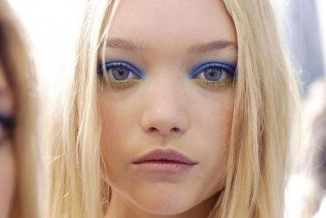 image via pinterest
When seeing makeup looks from the catwalk, they can often be something you think will only been seen only on the catwalk. Beauty looks can often be bright, exaggerated, or character like – something that the everyday woman cannot imagine applying on themselves to go to work or play.
For me, these catwalk trends give inspiration to try new designs with makeup and of course playing with new colours.
It is only then we can adapt our own makeup routine and modernise it to become more confident that we are on-trend with beauty looks, of course tailoring it to suit our individual lifestyle needs – very important to think of your own needs when trying something new and not just copying a look for the sake of it.
MB PRO TIP: When thinking about or actually applying colour on the eyes, remember to think about when you are wearing it. Is it day, night or to the office?
This will determine how far you can go and if you need high or low pigment. No one wants to look out of place going overboard with colour for the wrong occasion.
When wearing colour, it is important to always keep base/shading colours present. These normally flat shades of brown, taupe, caramel, grey, khaki, navy or even your trusty bronzer can give depth and shape to your eye, something you don’t want to pass up.
Every time you see a coloured eye makeup, there is normally slight shading still applied around the socket/bone area. If it is skipped, you run the risk of the colour taking over the entire look with no balance of highlight and shade.
Highlight and shade rules every decision I make when applying makeup. Bright, shimmery colours will make an area look larger while deeper, matte colours recede areas to give shape.
With this in mind, it is so important when using colour to not include it around the socket area. This area needs the balance of some depth to give the socket area lift and shape when a bright colour’s job is making areas look larger – its all in the balance.
Another important choice to make is to know what pop colour will suit you best. It is very important to get the eye colour out there when wearing colour, otherwise you have not achieved what colour is there to do.
When choosing colour, try going a contrast shade to your own eye colour. The beautiful wash of electric blue is a great contrast to green eyes. This would also work on brown/hazel eyes, but not as striking on blue eyes. The pastel green outline on upper and lower lash line works wonders on such a brown/hazel eye. This would not work as well on a green eye, but would pass better on blue eyes.
Keeping colour concentrated in the centre on the eye is fool proof if you want to try these trends out, but are not feeling to confident. Start application on upper lash line, in the very centre of the eye first, and then if confident, only then extend to inner and outer areas.
Colour should be a ‘pop’ and works best in everyday life when it is not in your face and subtle. The centre of your mobile eyelid works very well as most of it, when the eyes are opened, is not visible, so apply here to create the pop illusion – not scary!
If you are after more colour, you can add some on the lower lash lines, either by itself for a statement look – works very well for ladies that need more depth on top lid, or as we see with the pastel green visual, on in the inner part of the eye as well as top lash lines.
Hopefully these tips of choosing the right colour for your eyes, knowing where to apply the colour being mainly in the centre of your eye and keeping some shading present for balance, will give you the best pop colour look for this modern tricky trend.
MB PRO TIP: LESS IS BEST! Start small with colour, and only add when needed, rather than getting to carried away on first application. Balance is key to create a wearable version of these catwalk trends.
Want more advice for living a fabulous life? Follow us on Instagram or join the Rescu. community by tagging #liveyourfabuslouslife in IG posts.


